Interest rates are a strange beast. The average person’s relationship with “the interest rate” rarely extends beyond the benefit they get from savings, or the cost of a mortgage. However they can have wide-ranging long term consequences due to their subtle behavioural impact.
This will be quite a long story and, as with any story told by an analyst, it begins with a warning: Bad assumptions will lead to bad conclusions. That said, NO assumptions lead to NO conclusions – so I would rather reach some conclusions and know which way I may be off than make baseless claims.
And so it begins…
Data and Introduction
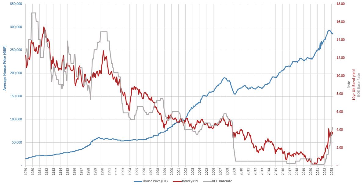
The graph above shows house prices (Average UK House Price in blue) against interest rates (represented as the Bank of England Base Rate in grey, and the 10 year UK bond yield in red). The first thing that stands out is that it’s a pretty good long term inverse correlation, with Interest Rates showing a downward trend and house prices showing an upward trend. The correlation between house prices and the bond yield is -90.1 (bear in mind the correlation of bonds with the Base Rate is still only 94.6).
This makes sense, both theoretically and anecdotally. First lets should consider bond pricing.

Bond price vs. yield relationship
Why does this relationship exist? It’s because once a bond is created it tends to persist even when interest rates change around it. Yes, there are opportunities to repay, re-fix rates, etc. but they typically have penalties associated. Imagine two bonds that are written on consecutive days, while Interest Rates rise from 2% to 5% overnight. Would you rather issue a new bond for £100 at 5%, or buy the old bond paying 2% for £100? In order to make the two equally valuable in the marketplace, the 2% bond would be worth less than the £100… Therefore, IR up, price down.
This conceptually extends to the housing market, not lease because mortgages are a form of debt just like bonds. Both involve large fixed sums exchanged over a period of time for a series of smaller payments. Consequently it stands to reason that they should both obey the same inverse relationship between the price and the yield (rate). Anecdotally, if a mortgage for the same amount becomes cheaper (lower IR), you could take out a bigger mortgage and over time this would bid up house prices.
Initial Analysis
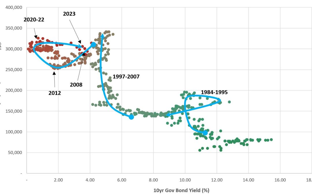
So what happens when we plot the house price / bond data on the same axes as a scatter plot?
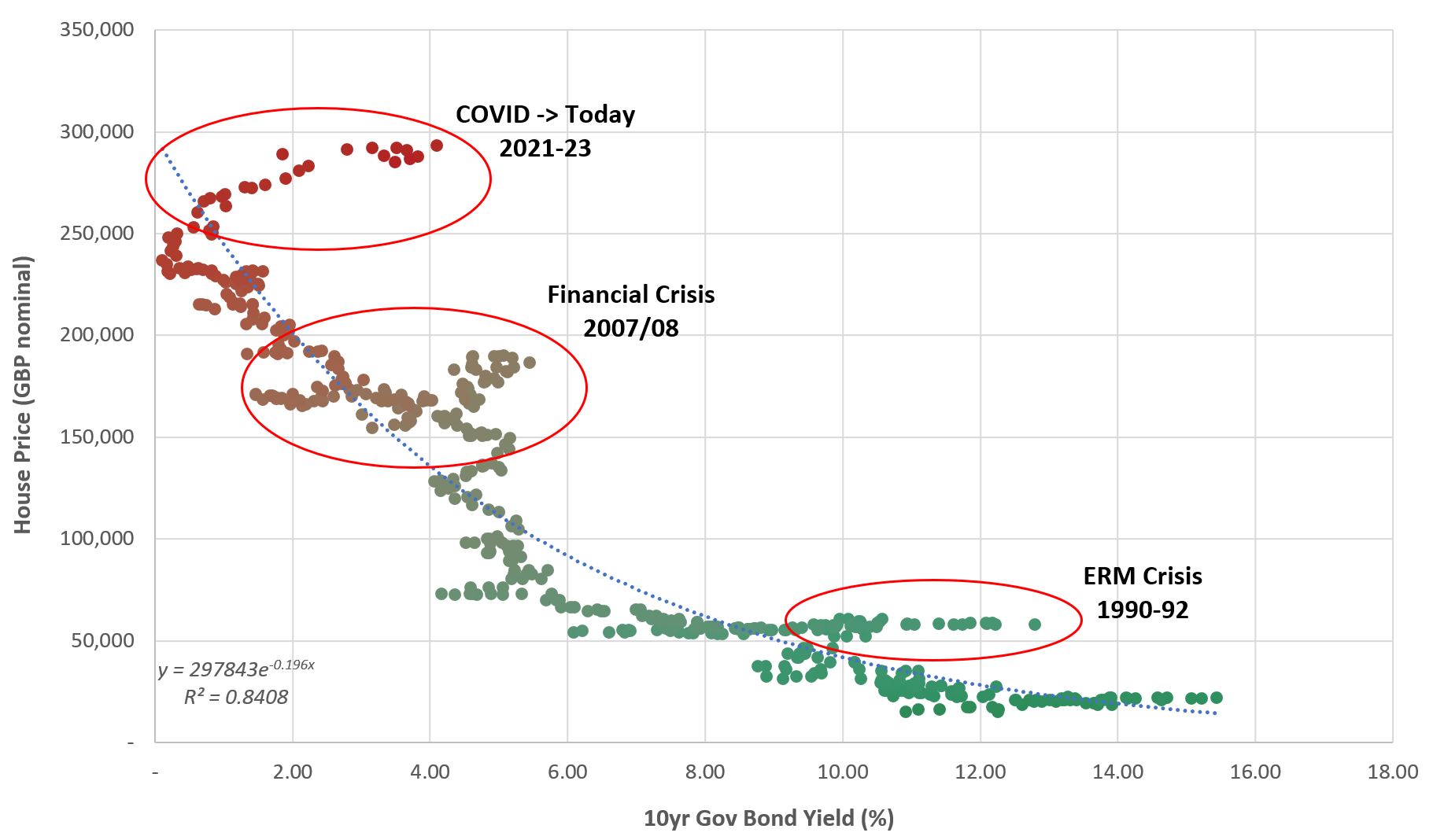
This shows a recognisable inverse relationship, as well as several anomalies coinciding with major events. Of these major events, perhaps be best analogy is the ERM Crisis of the early 90’s when the Interest Rate increased to tame inflation and keep the GBP within the bounds of the ERM. The sequence of events sounds plausible: Inflation -> Interest Rates -> House Prices. The 2007-08 Financial Crisis is subtly different when you look at the timings. Unusual rises in the house prices led to increased interest rates to tame them and, when recession was evident, a rapid and prolonged low in interest rates.
Considerations
Before coming to vague conclusions, what other considerations may be important?
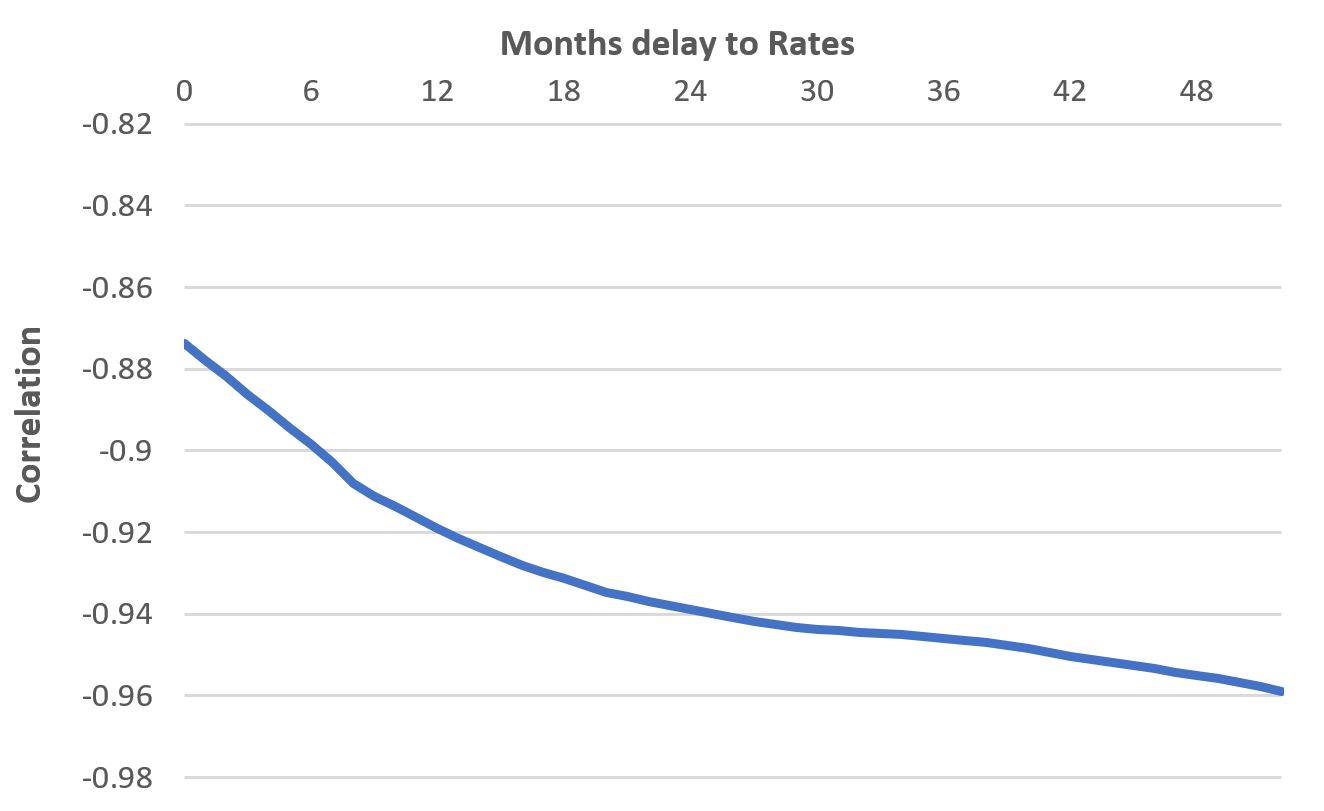
First is that there’s a time delay in the data. The numbers show peak-to-peak timing between the data sets of around 18-24 months. Unfortunately, using cross-correlation on the full dataset to find the optimal delay function is hampered by outliers at both the start and end of the data. As you add delays and effectively ignore those pesky recent interest rate increases (where there is no corresponding housing data because it’s yet to happen), correlation just continues to improve.
Second is the inflation element. While there are a variety of types of “inflation” and experts will argue over which is best to use, I have gone with simple RPI for which data starts in 1987. Why? Because House Prices minus house price inflation is, well, 1. By adjusting for inflation the hope is to perhaps not isolate, but at least highlight the Interest Rates component to their price rather than just general escalation over time.
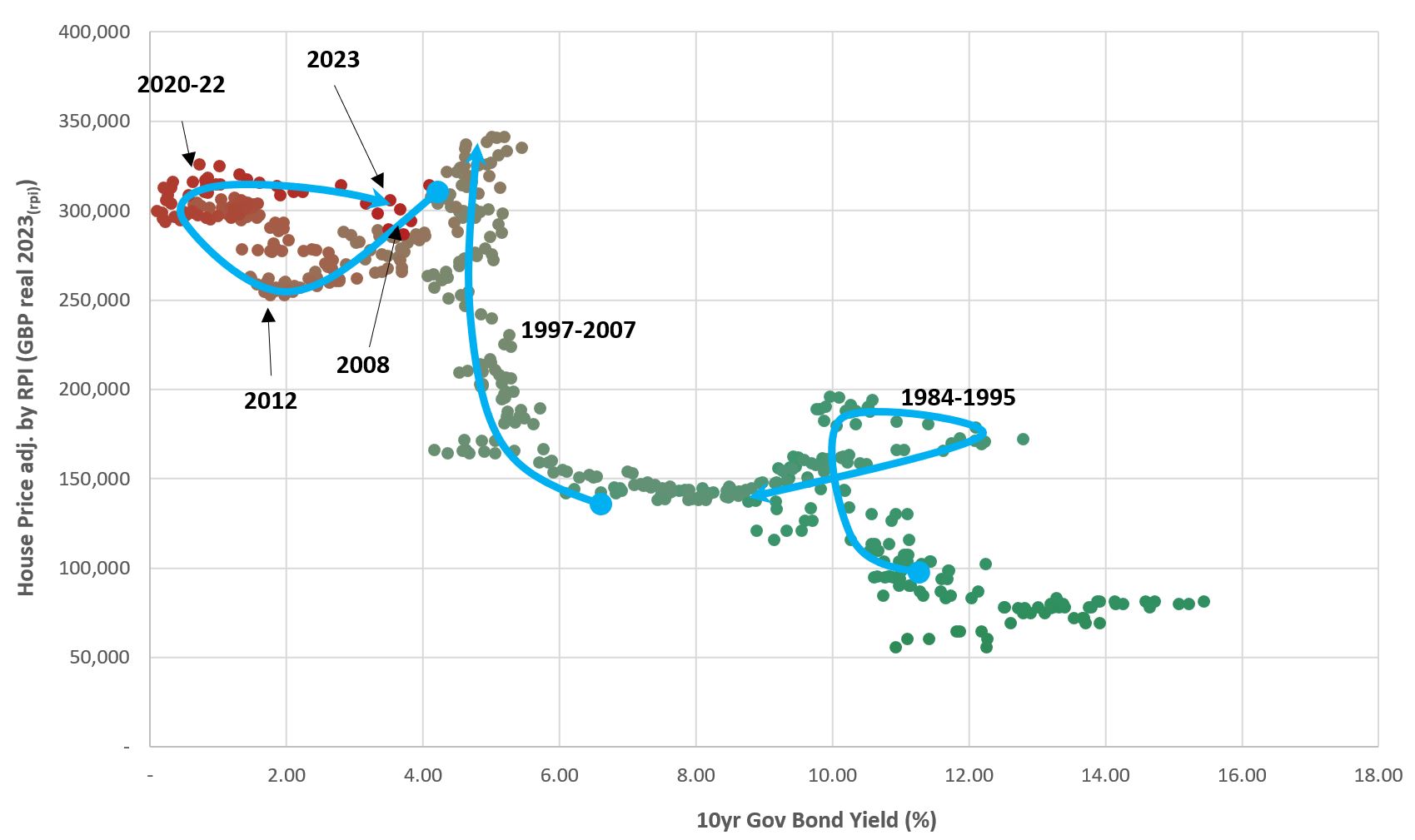
This echoes some of the previous messages – the disruption of the ERM Crisis and Financial Crisis are apparent – as well as offering some further insights. From this graph it’s apparent that the key phase of value build in the housing market was the run-up to the Financial Crisis, with housing prices outpacing inflation seemingly without the added fuel of ultra-low interest rates.
Since 2007/8 house prices fell in real terms (perhaps helped by the low inflation) before rising to their new peak in mid-2021. They have since moved sideways with inflation more than compensating for any house price increase. We are now perhaps in a phase of both falls in house prices AND material inflation.
Where next?
As far as this post is concerned, there’s no point in analysing something if you don’t think about where things will go. I’ll assume that 0% continues to be a lower limit on Interest Rates. Consensus today (July 2023) is that there may yet be raises left in the BofE. Whether this is true or not, it’s fair to think that this time will be similar to previous events, with house price falls happening in slow motion over the course of the next 2 years. In this timeframe, a further fall of 15-20% from today in nominal prices (akin to a 25% fall in real prices) is not inconceivable, reaching an average house price of £240-250k by the end of 2024.
From there, with 0% a limit and assuming we will eventually return to that level, I would be surprised if house prices ever repeated their rapid escalation as they did around the turn of the millennium without previously having a marked fall. However, they could indeed maintain a real price level while rising at the rate of background inflation nominally.
For the wider blog though, I think it’s worth looking at affordability next. With inflation perhaps outstripping wage growth for many, while mortgages are locked into historically high house prices, how do things look for people in the next few years?

